You are here: Foswiki>Homepages Web>CreateHomepageTopic>HomepageGosiaSudol>HowmepageGosiaSudolFinalPlots (2019-10-01, GosiaSudol)Edit Attach
Final_plots
Section 1 : Introduction
Section 2 : Experimental setup and data analysis method
Figure 1, as it was up to now.
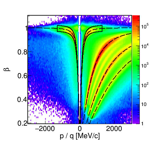
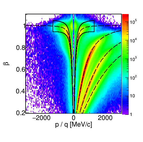 we propose to add 2D raw yield as it is shown in the plots below. Those plots are done for 0-10% centrality. they are normalized to the corresponding number of events.
red lines are plotted in order to show what is a limitation on that plots, angles : HADES acceptance and momentum lines shows my 1300MeV upper momentum cut.
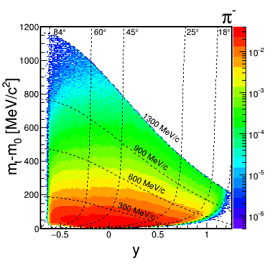
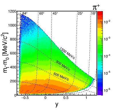 Section 3 : Results
Figure 2. As to Fig.2 I propose to show two plots for pi+ and pi-: dn/dpt at midrapidity 0-10% (the nicest)
and in addition at y=1.44 30-40% (the worst) all four with fits and lower part with ratio.
It is not well visible on plot, but fit function is crossing 0,0 point.
We would propouse that those plots will be in linear scale!!
For the mt, pt extrapolation please refer to the following papers :
Schnedermann, Sollfrank and Heinz, PRC 48 (1993) 2462
R. Hagedorn, Nuovo Cimento Suppl.3, 147 (1965). I have attached this paper in the table below as Hagedon.pdf
In this case for the pt-fit, function which was used is as follows :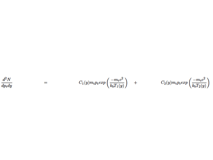
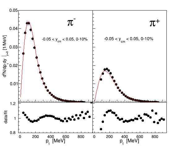
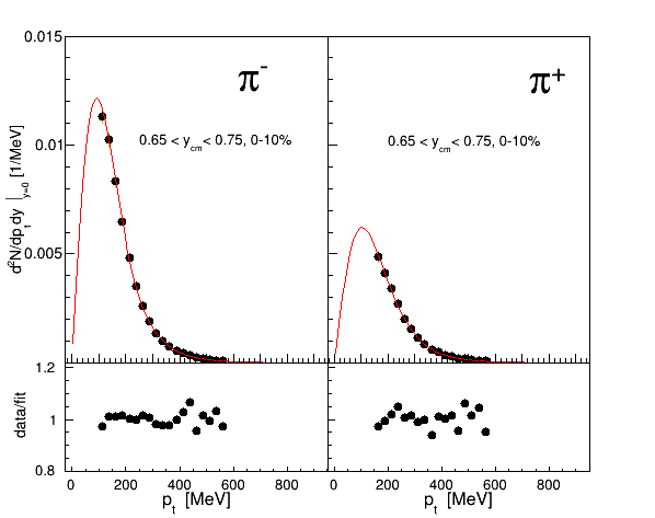 Figure 3 , as it was up to now.
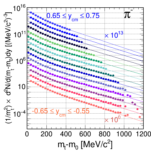
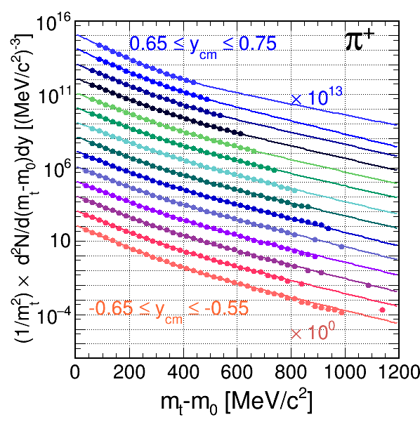 Also as we agreed T1 and T2 from mt fir should be included into the publication for both pions.
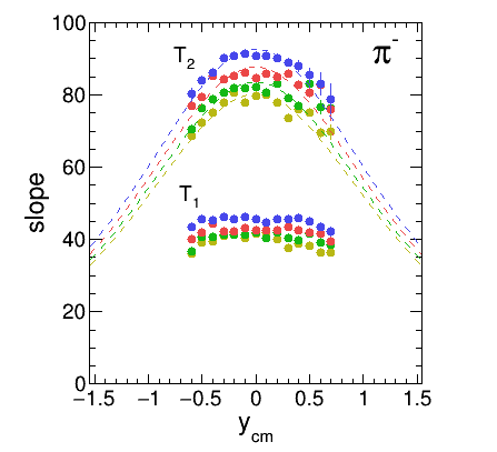
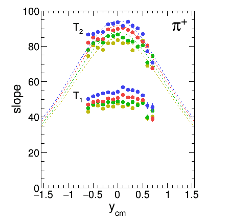 Figure 4 , as it was up to now.
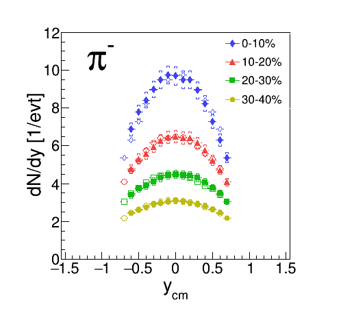
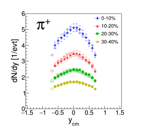 Figure 5 , looks boring. Why not plot <pi> vs Apart..
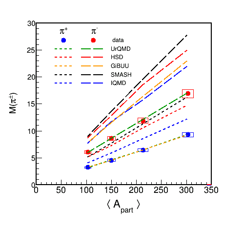 Section 3.1 : Energy and system size dependence
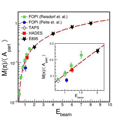
Figure 6 It would be nice to have also some model calculation results in both plots of Fig.6!
(Pion multiplicity as a function of Apart and Ebeam)
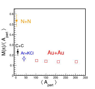
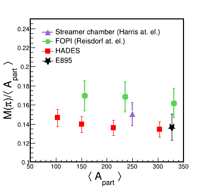
 Section 3.2 : Coulomb potential and pion spectra
Figure 7 , The new Fig.7 becomes the old Fig.12
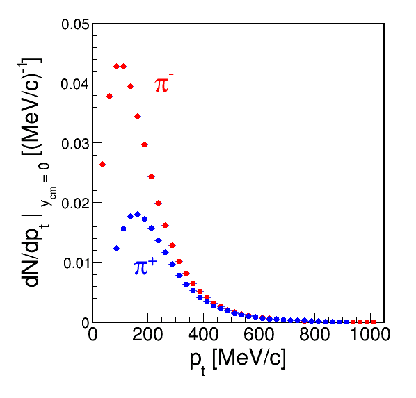
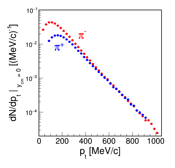
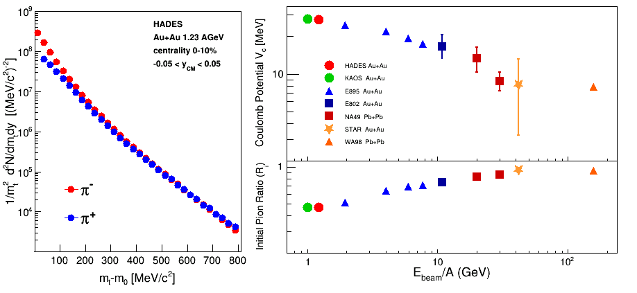 The idea is to add comparison of Pt spectra at mid-rapidity. One should keep in mind that at mid-rapidity pt = p_cm. Probably linear scale is better, but just in case i add both plots for a now.
 Section 3.2 : Polar angle distribution of pion emission
Figure 8 , becomes old Fig.13 without model calculations but fit curve representing A_2.
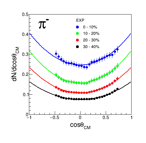
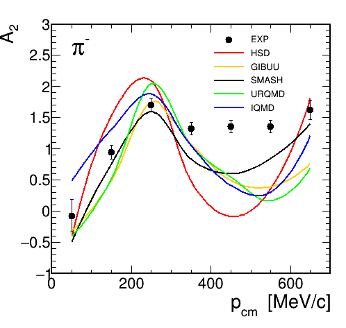
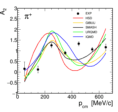
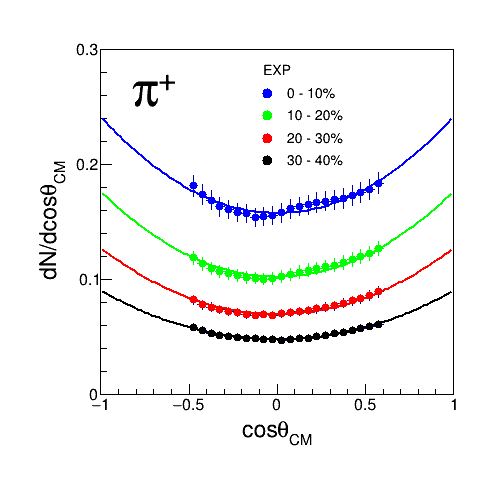 Figure 9 , becomes old Fig.14, but as Gosia proposes A_2 vs p_cm (with models) for 0-10% and pi+ and pi-.
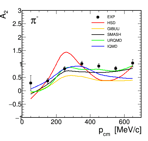
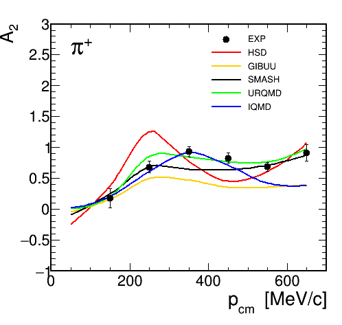 Figure 10 , I suggest to also add the corresponding pcm plots (as Fig.10).

 Figure 11 becomes old Fig.15 without Urqmd. Do we understand the systematics? Do we have a p+p point?
Into your plot a2 vs N_part you can add pp (N_part=2). It was measured
in K.L.Wolf et al. Phys. Rev. Lett. 42 (1979) 1448; Phys. Rev.C26 (1982)
2572. Can you find there precise values? Stock in his review writes as
A2>3. (PLUTO based on these data gives ~5 as we write in CC paper).
Conc. A2 there is nove discussion in this Stock's paper Physics Reports
135, No. 5 (1986) 259-315.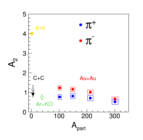 Section 4 : Comparison to models
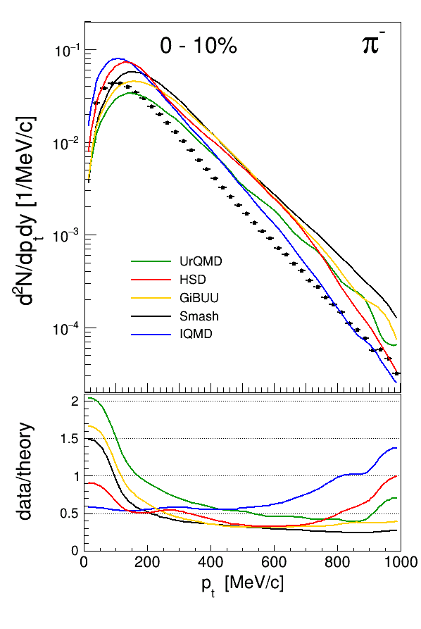
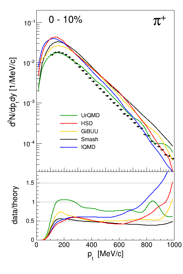
Figure 12 becomes an old Fig 7.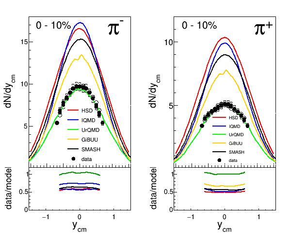 Figure 13. Becomes old Fig8 but in dNdPt representation at mid-rapidity.
 As we agreed on our last meeting i added also A2 vs. p_cm comparison with models for the centrality 30-40%. The idea was to add those plots into the models comparison chapter.
 Section 5 : Conclusions
-- GosiaSudol - 15 Aug 2019
Section 2 : Experimental setup and data analysis method
Figure 1, as it was up to now.

 we propose to add 2D raw yield as it is shown in the plots below. Those plots are done for 0-10% centrality. they are normalized to the corresponding number of events.
 red lines are plotted in order to show what is a limitation on that plots, angles : HADES acceptance and momentum lines shows my 1300MeV upper momentum cut.

 Section 3 : Results
 Figure 2. As to Fig.2 I propose to show two plots for pi+ and pi-: dn/dpt at midrapidity 0-10% (the nicest)
and in addition at y=1.44 30-40% (the worst) all four with fits and lower part with ratio.
It is not well visible on plot, but fit function is crossing 0,0 point.
We would propouse that those plots will be in linear scale!!
For the mt, pt extrapolation please refer to the following papers :
Schnedermann, Sollfrank and Heinz, PRC 48 (1993) 2462
R. Hagedorn, Nuovo Cimento Suppl.3, 147 (1965). I have attached this paper in the table below as Hagedon.pdf
In this case for the pt-fit, function which was used is as follows :


 Figure 3 , as it was up to now.
 Also as we agreed T1 and T2 from mt fir should be included into the publication for both pions.
 Figure 4 , as it was up to now.
 Figure 5 , looks boring. Why not plot <pi> vs Apart..
  Section 3.1 : Energy and system size dependence
 Figure 6 It would be nice to have also some model calculation results in both plots of Fig.6!
(Pion multiplicity as a function of Apart and Ebeam)
In case of Fig6 left for the fit pol2 is used.To fit data from FOPI (wihtout Pelte), TAPS, HADES and E895 were used.
Fit parameters are as follows: a0 = -0.0536, a1=0.172, a2=-0.00308


 Section 3.2 : Coulomb potential and pion spectra
 Figure 7 , The new Fig.7 becomes the old Fig.12
 The idea is to add comparison of Pt spectra at mid-rapidity. One should keep in mind that at mid-rapidity pt = p_cm. Probably linear scale is better, but just in case i add both plots for a now.
 Section 3.2 : Polar angle distribution of pion emission
 Figure 8 , becomes old Fig.13 without model calculations but fit curve representing A_2.

 Figure 9 , becomes old Fig.14, but as Gosia proposes A_2 vs p_cm (with models) for 0-10% and pi+ and pi-.
 Figure 10 , I suggest to also add the corresponding pcm plots (as Fig.10).
 Figure 11 becomes old Fig.15 without Urqmd. Do we understand the systematics? Do we have a p+p point?
Into your plot a2 vs N_part you can add pp (N_part=2). It was measured
in K.L.Wolf et al. Phys. Rev. Lett. 42 (1979) 1448; Phys. Rev.C26 (1982)
2572. Can you find there precise values? Stock in his review writes as
A2>3. (PLUTO based on these data gives ~5 as we write in CC paper).
Conc. A2 there is nove discussion in this Stock's paper Physics Reports
135, No. 5 (1986) 259-315.
 Section 4 : Comparison to models
 Figure 12 becomes an old Fig 7.
 Figure 13. Becomes old Fig8 but in dNdPt representation at mid-rapidity.
 As we agreed on our last meeting i added also A2 vs. p_cm comparison with models for the centrality 30-40%. The idea was to add those plots into the models comparison chapter.
 Section 5 : Conclusions
 -- GosiaSudol - 15 Aug 2019
Edit | Attach | Print version | History: r22 < r21 < r20 < r19 | Backlinks | View wiki text | Edit wiki text | More topic actions
Topic revision: r22 - 2019-10-01, GosiaSudol
Copyright © by the contributing authors. All material on this collaboration platform is the property of the contributing authors.
Ideas, requests, problems regarding Foswiki Send feedback | Imprint | Privacy Policy (in German)
Ideas, requests, problems regarding Foswiki Send feedback | Imprint | Privacy Policy (in German)


